

5+3 mistakes to avoid when creating a logo
Creating a company logo is one of the fundamental aspects of a brand’s recognisability. A well-designed logo is the distinctive element that makes the difference between a company that stays in people’s memory and one that goes unnoticed. Ugly or poorly refined logos, on the other hand, can seriously damage your brand’s reputation.
Table of Contents
Logo design: a balance between art, science and strategy
Logo design is both an art and a science. It expresses a company’s values and identity in a single, small symbol. This makes it a vital part of any branding strategy.
However, in the rush to create something eye-catching without wasting time, many companies make crucial mistakes.
5 mistakes to avoid when creating your company logo
Here are five mistakes to avoid when creating a logo.
1. Neglecting brand identity
When it comes to logo design, it’s essential that it reflects the company’s history, values and vision. Thinking of a logo as merely a nice drawing is a serious mistake. We can’t stress this enough!
2. Copying from competitors
If your logo looks too similar to those of your competitors, you risk confusing customers. Differentiation is essential, especially when creating a company logo. And imitating others, particularly if they are already well known in the sector, is unlikely to lead you to success.
3. Using poor design
When creating a logo, there’s a temptation to stick to easy templates that seem satisfactory enough, but that in the long run can prove unsuitable.
- Logos with an insignificant design: A generic or trivial design might give the impression that the company doesn’t have a clear or distinctive identity, or that it wasn’t willing to invest in a proper graphic study of its vision.
- Overly intricate logos: An overload of detail is just as wrong. A logo must be immediately recognisable. If it’s too complicated, it won’t stick in people’s minds. Simplicity is the key to a company logo’s elegance.
- “Overly” trendy logos: Trends come and go. Creating a logo based solely on the trend of the moment can make it obsolete in no time. The goal should be to create a design that doesn’t require a redesign every time the trend changes, but that at most needs small adjustments, keeping its recognisability.
4. Underestimating colour
Once the pictogram (if any) and the logotype have been defined, the right attention must be paid to selecting the colours. Choosing a colour palette is complex and must be done carefully, ensuring that it is in line with the message you want to communicate with the logo, through the emotions evoked by the different colours. The logo’s colours must be harmonious and representative of the brand.
5. Neglecting versatility
Beyond graphics and meaning, a logo’s functionality plays a key role. A logo must in fact be versatile and adaptable to a variety of situations and formats.
- Resizing: A logo must be usable in different online contexts, from the website to social media, from emails to newsletters. Depending on the graphics, it will be reproduced in different sizes. A design that is too complex or too thin might not be legible when resized.
- Adaptability: A successful logo must look good both online and offline. It must be adaptable to any type of medium, from the business card to the billboard.
- Colours: The colours must be easily reproducible. It’s essential to choose a palette that is not only representative but also versatile. The chosen colours must be effective and consistent across various media and applications, both online and in print, ensuring that the brand’s message remains uniform.
3 mistakes to avoid after creating your logo
When designing a logo, it’s essential to focus on the brand’s main visual representation, but there are other elements, often overlooked, that are just as crucial.
1. Ignoring the payoff
The payoff, or tagline, is an element of great strategic value that accompanies the logo. This short message must communicate in a few words what the brand stands for. It goes beyond mere graphics, providing additional context and perspective on the company’s mission and values. It captures attention and ensures that the logo communicates effectively.
2. Forgetting to register the logo
After creating your logo, it’s essential to register it in order to protect and not lose the rights to use it. This prevents possible disputes and ensures that the logo remains unique.
3. Forgetting to register the domain
Once you’ve chosen your brand name, it’s essential to proceed with registering the website. This will ensure that your domain is protected and that no one can use a similar name to mislead customers. You can do this even before you’ve created the logo. However, if it’s a logo based solely on the logotype – that is, on a word, a name or an acronym – you’ll need to register it as soon as you’ve decided what the final logo will look like, in order to have a domain that exactly matches the logo.
Examples of famous logo designs and their evolution
Let’s look at some examples that show how companies can evolve over time, moving from more complex or suboptimal designs to logos that are now iconic and easily recognisable worldwide.
Examples of ugly logos that were completely redesigned
The old Ford logo
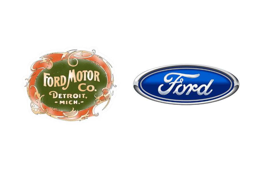
We’re putting this among the “ugly logos” for its intricate design. This excessive detail can be difficult to reproduce at small sizes and might not be easily recognisable from a distance. Naturally, the main reason in this case is that the way a logo is used has changed enormously from the year the Ford companies were founded until today. The current Ford brand is clean and immediately legible and recognisable.
The old Apple logo
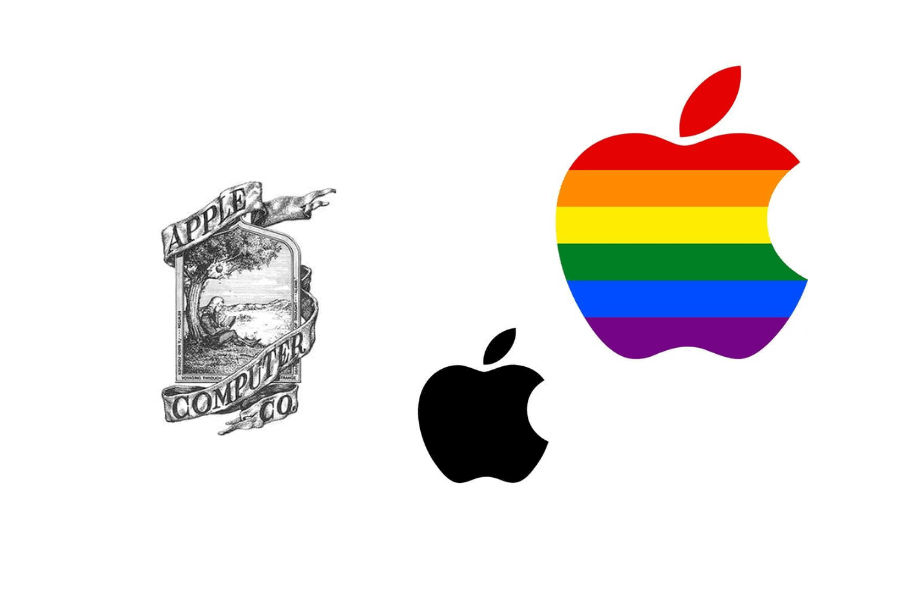
This logo has a very detailed design that could lose its impact if resized. Moreover, the complex image could distract from the company’s name and purpose. This 1976 logo was created by Ronald Wayne, a brilliant engineer but a beginner graphic designer. In 1977, Rob Janoff, a well-known professional graphic designer, was asked to redesign the logo. We all know the result! The bitten apple, simple but powerful, reflects knowledge and innovation with an elegant and incisive line.
The old Procter & Gamble logos
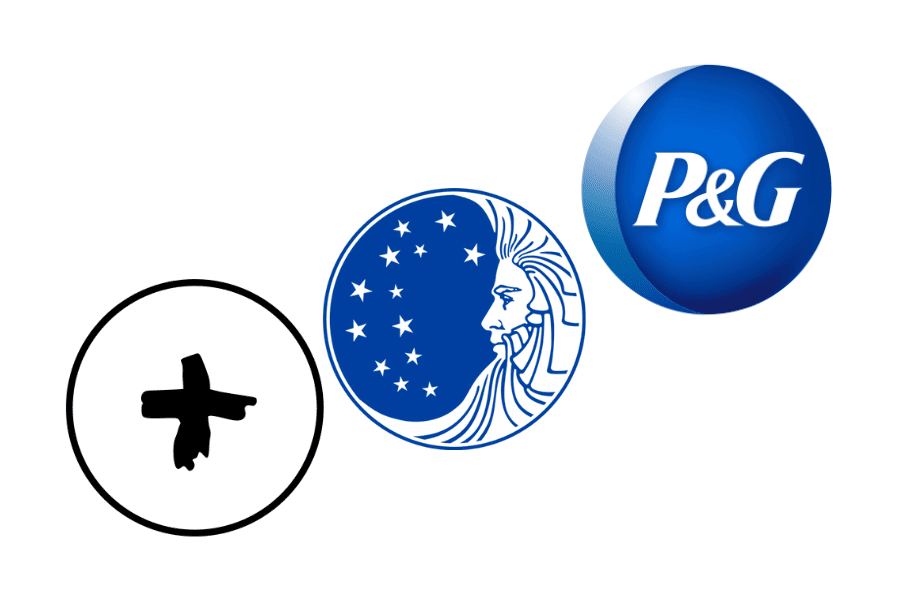
From the first logo, made in 1851 with a cross symbol with irregular edges, to the current one, there have been more than ten changes, some more radical than others. These steps led to logotypes that were either too simple or too complex. The elegance of the current one is, finally, immediately recognisable, professional and easy to remember.
Examples of well-designed logos that were updated
The Instagram logo
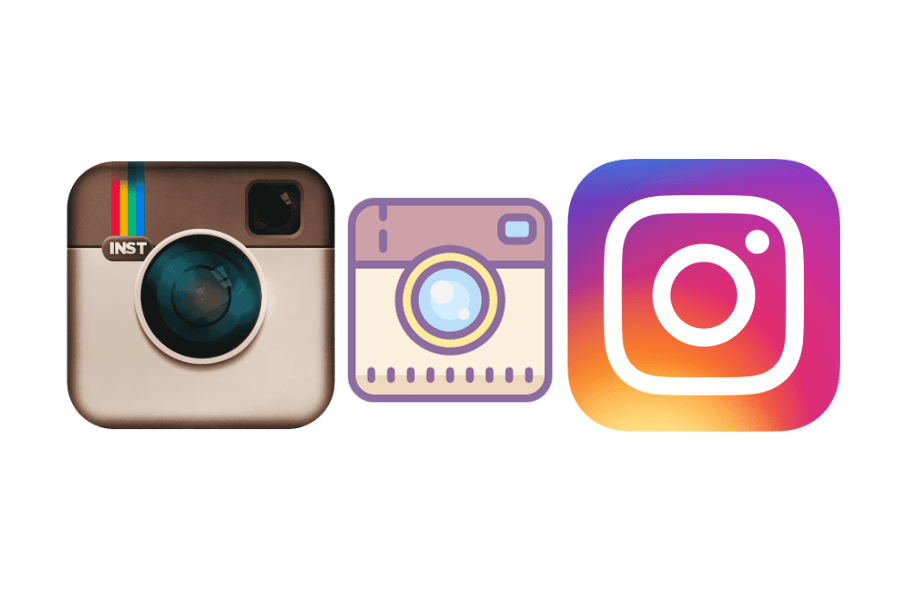
From the very first version, Instagram’s logo was clear, distinctive and appealing. However, the first realistic design of a camera can be considered somewhat limited to a purely photographic context and, moreover, features details more akin to a complex drawing than a logo. The need to stylise was fully met with the current logo: modern, colourful and representative in the broadest sense of the term.
The Dell logo
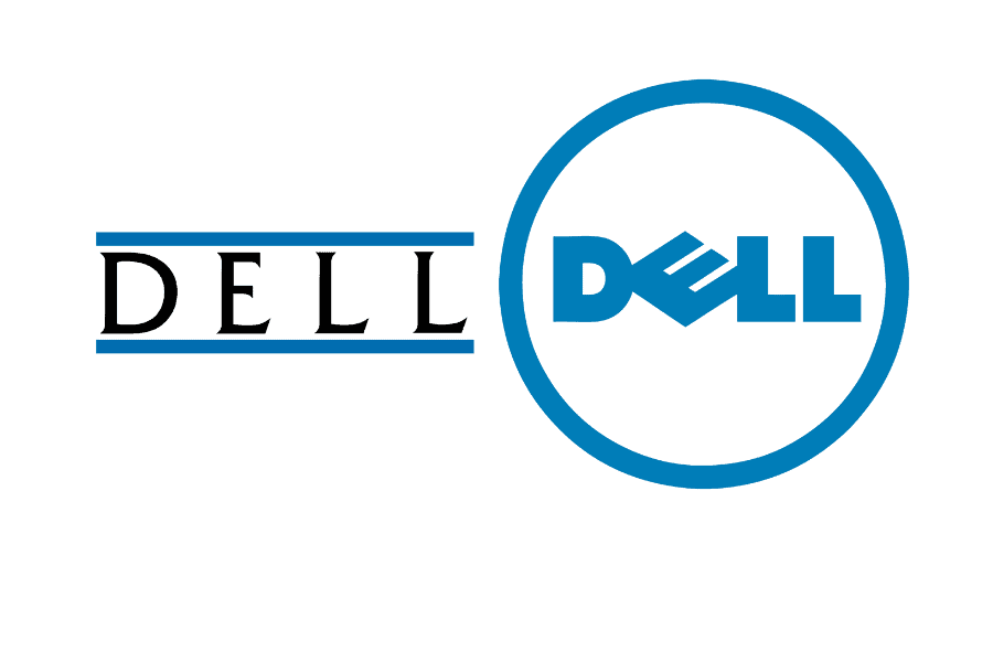
The initial design featured a simple, straightforward typeface, so it was appealing and recognisable right from the start. It lacked, however, a distinctive identity – in short, it was a bit ordinary. In the current logo, the design is decidedly modern. It still incorporates the company name, but this time in a more defined graphic form, thanks to the circle and the tilt of the “E”, which gives the logo a sense of movement. Moreover, the use of the circle could suggest globality and integrity. Certainly more distinctive and recognisable in its current form, the new logo is also more versatile for various uses and advertising media.
Creating a successful logo requires a professional
Choosing to turn to professionals for logo design is a wise decision. Industry experts can guide you through every step, from creating the company logo to defining the brand identity, ensuring that every element is in line with your vision and your values. By avoiding the mistakes listed above, you’ll have a powerful and distinctive logo that will contribute to your company’s success.
Related service: discover Brand Identity by ARvis — the agency that scales with you.