

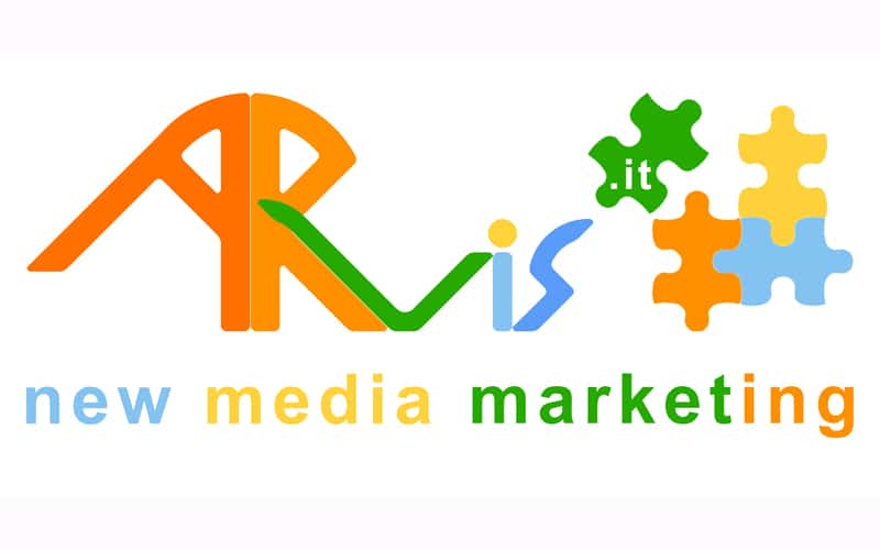
ARvis.it’s new logo for its 15th anniversary
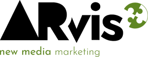
To celebrate 15 years in business, ARvis.it presents its new logo, redesigned with different lines and reshaped in both the wordmark and the pictogram. ARvis.it’s new logo was born as the expression of a renewed and fresh communication style: fluid yet considered, lively yet self-aware. While remaining true to its origins, the new shapes and new arrangements deliver a modern, recognizable logo.
Table of Contents
A new logo, the same colors
The colors, first of all, are faithfully retained, even though the various shades of orange and light blue are now distributed differently. They still convey the same eclecticism and vitality, but with greater harmony, without embossed outlines, leaving room for natural contrasts and gradients.Harmonious shapes
The letters that make up the ARvis name, previously merged together in a continuum, are now separated by spaces. Although almost imperceptible, these slight gaps are enough to make the characters legible one at a time. A graphic touch that gives strength to each of them individually.A new pictogram
The 4 puzzle pieces, conversely, are no longer completely separate: we now find them partly assembled. Three pieces now form a single, tightly connected group, awaiting the fourth piece, which seems to be drawing closer and is now on the verge of joining. The final piece catches the eye and sparks the desire to unite it with the rest of the puzzle. It is precisely the piece that brings the .it to the group. A symbolism that is partly a metaphor for the closer connection between online and offline in recent years, awaiting their definitive union, and at the same time a metaphor for ARvis.it’s own marketing strategies.A metaphor for innovation
This puzzle combination is also the figurative expression of new structures, new perspectives and new ambitions within the company. In short, great innovation in a company that nonetheless carries within it the same drive and the same energy as always, as Valerio Amendolagine explains: “After 15 years in business, we wanted to communicate the changes that have taken place in our company. From 2006 to today, there have been quite a few! Necessary changes, often driven by us, sometimes prompted by external events, as in 2020, but always seen as opportunities to improve and innovate. We have grown quite a lot since then and we have also become more solid: it’s time to make that visible through the symbol that represents us”. The CEO describes the choice behind this graphic innovation this way: “I spoke at length with our Art Director. Together we looked for the best way to visually express what ARvis.it has become. I have to say I’m very pleased with the result. This logo represents the company and all of us well: as enthusiastic as 15 years ago, but more solid. In short, we’re still here, we haven’t betrayed our intentions. We keep the same course, but we’ve adapted to change in the continuous pursuit of the best way to renew ourselves and grow our clients alongside us”.A symbol of the company’s values
Updating and innovation are the primary ingredients of any digital marketing agency. Without them, it is impossible to carry out valuable online communication and promotion projects. The ARvis.it team is well aware of this. Continuous study and meticulous research are the cornerstones of every update. Just as “…the exchange of ideas and listening to new needs, both of clients and of the team, are the roots of innovation – Valerio Amendolagine adds – We never neglect these fundamental elements, which serve to grow internally and, at the same time, to develop clients’ projects in the best possible way. We invest heavily in updating and in time dedicated to ideas. The satisfaction of everyone, clients and collaborators alike, must be the ultimate goal. It’s our recipe for offering quality consulting and products”. If you then add enthusiasm and transparency to this recipe, you get a company where the quality of the work is at the heart of every objective. The harmonious blend of letters, shapes and colors in the new logo represents it perfectly.Related service: discover Marketing Consulting by ARvis — the agency that scales with you.