

5 tips for creating an understandable dashboard
Monitoring data is essential for strategic online communication: here are 5 tips for building custom dashboards that let you keep all your online activities under control.
Companies, institutions, professional practices, businesses and freelancers now need to keep the data they handle and its flows under control. They therefore need platforms, or dashboards, to monitor data and insights so they can act in a precise and controlled way, especially in marketing activities.
But how can you make everything easier to understand and use?
More and more often we hear about insights, data-driven marketing actions and data-backed strategies. Just as often, however, this data is difficult to collect and even more complicated to read. Between inscrutable categories and English terms, data that seems so objective and precise starts to blur.
That’s why it’s better to gather this data in a single control panel, intuitive and easy to read, to monitor the situation.
Table of Contents
Dashboard: what it is and what it’s for
A dashboard is a control panel that gathers data from the various online touch-points. Dashboards can be used to monitor the performance of advertising campaigns on Facebook or Google, as well as to view website performance.
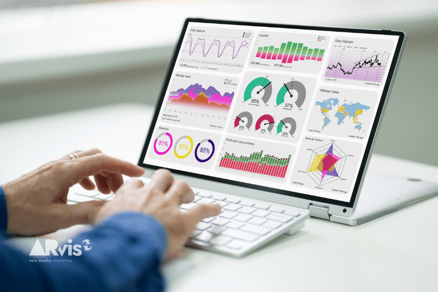
The main function of dashboards is precisely to monitor and visualize data. Through charts and tables, these platforms show the numbers of your online activity in an analytical and comprehensive way.
Since a company’s online touch-points are numerous, dashboards will also need to contain different sections for each channel. Alternatively, you can rely on the individual control panels of each communication tool.
Facebook dashboard for professionals: an essential tool
Among the main online communication channels for companies and professionals is Facebook. From the business Page on Facebook, with which to share relevant content according to a well-designed editorial plan, to advertising, there is a lot of information to keep under control on this platform.
That’s why Facebook itself has implemented the dashboard for professionals, a section dedicated to those who professionally manage a company’s Facebook Page and advertising account.
In this section you can see the Page insights, including post reach, new Page “likes”, and the demographic data of the Page’s audience. From here, you can also access the ads center and the Business Suite, to publish and schedule posts and advertising campaigns. Another very important aspect concerns “Page access”, which is used to manage permissions and roles for those who need to access and use the Page.
In short, Facebook’s dashboard for professionals lets you have an overview of your business Page and access the purely advertising sections to monitor ads and generate reports on campaign performance.
Creators can’t do without Instagram dashboards
Staying within the Meta ecosystem, a company can decide to open an official Instagram account for its business. This is a smart move especially for certain commercial sectors, because Instagram is a social network that allows very direct and engaging communication. Managing an Instagram account, however, requires a lot of attention.
That’s why you can access the dashboard for professionals directly from the app, since Instagram is a social network geared exclusively toward mobile. In a nutshell, you could say that Meta has adapted the dashboard designed for Facebook to the Instagram channel. On Instagram in particular, you can access the account insights (accounts reached, content published, follower growth), the advertising tools to create ads directly from the app, and a section dedicated to finding inspiration from viral content.
With the Google dashboard you keep everything under control
Google, too, has implemented a single control panel to monitor all the resources associated with your Google account. Google Dashboard is in fact a platform that displays and gathers all the activities carried out by your Google account and the resources associated with it: Google Analytics, advertising campaigns on Google, Gmail inboxes, files saved on Google Drive, and so on.
In addition to this summary screen, however, Google has launched another platform specifically for data management. Looker Studio is in fact the evolution of Google Data Studio, a customizable dashboard derived from the Analytics suite in which to manage data and create informative reports on online activities.
Why create custom dashboards to visualize data better
Of course, other social and advertising business platforms, in addition to those mentioned, also have their own data collection platforms, to highlight data and insights on the activities carried out on that specific channel. Yet this multiplicity of data-organizing forms and systems risks achieving the opposite effect: instead of increasing control, you risk losing sight of the important data.
For a truly data-driven approach to communication, and therefore a scientific strategy, the ideal move is to bring together the most important data from each platform into a single dashboard. Creating custom dashboards serves to have a view of the most relevant data in a unified, coordinated and integrated way, so you can read the performance of your various online activities at 360° with a single tool that integrates everything.
Not only that: the dashboards provided by the platforms are static and fixed, whereas building custom dashboards lets you customize the layout and the graphics. This means creating tailor-made control panels, designed ad hoc for your needs, adding charts, tables and colors according to your reading requirements.
One tool for building custom and customizable dashboards is precisely Google Looker Studio, but there are also other DMPs on the market, that is, data management platforms that allow you to build tailor-made control panels.
Our 5 tips for creating an understandable dashboard
But how do you create a clear and understandable dashboard? Here are our 5 tips!
1) Keep it simple: only relevant KPIs
There is a huge amount of online data, and precisely for this reason it’s easy to get confused. Not only that: having a large amount of data available, you run the risk of focusing on vanity metrics and losing sight of the truly relevant issues.
To be successful, a custom dashboard must be concise and analytical. It should include only the KPIs that are truly useful for achieving your goals. Few sections and few elements, but ones that are genuinely valuable: this way the dashboard will be understandable and useful.
2) Use colors
The visual impact of the dashboard must facilitate its reading and understanding at first glance. That’s why the use of colors is a fundamental factor for the usability of the dashboard.
For example, using different colors for different objectives can be a winning move to aid the understanding of the data.
3) Choose the right charts
Having numbers laid out neatly in tables doesn’t help you understand the performance of your activities. It’s much better when these numbers are transformed into charts that visually and intuitively convey the trend of your online activities.
Not all charts, however, are the same. You need to choose the right formats to best tell the story of the data you need: it’s obvious that campaign trends over time require different charts from those used for buyer persona percentages. But it must also be said that not all users perceive the same charts in the same way. Some people are more comfortable with two-dimensional charts and others prefer 3D ones, or some need data directly on the chart, or still others need ever-present legends that clearly explain the data. In short, you need to find the chart models you are most familiar with in order to create a dashboard tailored to your needs.
4) Interactivity
Numbers and data serve to capture a specific advertising campaign or a particular page of the website. So why not include a link to that ad or that section of the site?
This way, with a simple click, you’ll be able to move from the chart to the creative, gaining a more complete view of what you’re analyzing.
Especially for advertising, this step proves to be essential. Advertising campaigns owe much of their performance to multimedia creative content. Creating a direct connection between creative content and results can help you set future strategies.
5) Continuous updating
On the web, nothing stays still and unchanged for long. Platforms are constantly evolving, as are Google’s algorithms and users’ usage habits. In the same way, not even dashboards can ever be considered immutable and definitive.
Not only that: over time, a company’s communication strategies and the channels of its online activities change.
That’s why dashboards must be designed to accommodate changes and developments, always providing new tailor-made solutions.
Are you planning to bring together all the useful data in a custom dashboard tailored to your business needs?
Let’s talk about it
Related service: discover Marketing Consulting by ARvis — the agency that scales with you.