


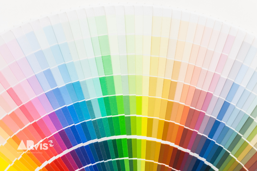
Website Colour Palette: The Art of Creating a Visual Identity
Stepping into the world of web design means engaging with a range of crucial elements, among which the choice of a website colour palette plays a role of undeniable importance. In fact, it is a cornerstone of brand identity and the user experience.
If you consider choosing the colour palette for your website a mere detail of little importance or a minor consideration, I invite you to think again. Colour choice exerts a considerable influence on online browsing and on the user’s overall experience.
That is why the process of selecting a palette is not trivial and should not be based on personal taste or copied from other brands.
Table of Contents
The importance of the colour palette on a website
In the digital world, first impressions are decisive. The choice of palette plays a crucial role in this. Various studies have shown that up to 90% of consumers’ initial impression is based solely on colours. Selecting the colour palette, therefore, is not merely an aesthetic choice but a strategic decision that can have a significant impact on the perception of your brand, on the user experience and, consequently, on your site’s performance.
Colour choice as an element of brand identity
In the field of digital design, brand identity is deeply tied to visual appearance. Colour is, to all intents and purposes, a branding tool. It is one of the first elements users notice when they visit a website. Colour can influence mood and emotions, and it can also help set your brand apart from the competition. Website colours are not merely an aesthetic element; they represent the heart of the brand’s identity, acting as a bridge between the brand and its users.
The impact of colours on the user experience
The choice of colour palette has a powerful effect on the user’s overall experience. Contrasts and harmonies make navigation easier, prompting users to click on a call to action or a link, helping them find the most important information and encouraging them to keep browsing. They are therefore a useful tool for navigation and important for the harmony and beauty of every web page. It should not be forgotten, however, that when choosing website colours you must consider not only the aesthetic aspect but also the emotional effect that colours generate.
Colour psychology and user interaction
Colour psychology is a crucial aspect to consider when choosing a website’s colour palette. Each colour evokes specific emotions and reactions in the visitor, which can significantly influence their behaviour and decisions.
The emotions connected to colours
Let’s look at the emotions evoked by the primary colours, the most effective starting point for a professional colour choice.
Blue: the colour of reliability
Blue is a colour that conveys reliability. It is often chosen in sectors where consumer trust is the most important factor and where professionalism and reliability are key selling points. Blue does not stimulate impulsiveness, spontaneity or emotion. On the contrary, it encourages a calm, rational decision-making process.
Red: the colour of attention and passion
Red, by contrast, is a colour that conveys attention and passion. It is often used in sectors that rely on emotions and impulsive decisions, such as restaurants and fast food. Red is known to stimulate the appetite, which is why it is one of the favourite choices among international food brands.
Yellow: the colour of optimism and energy
Yellow, the brightest tone in the colour spectrum, is a colour that embodies positive qualities such as optimism, uniqueness, wisdom, sharpness, creativity and energy. It is the colour of the Sun, so it evokes willpower, instils a sunny disposition and acts as an impulse to action.
Green: the colour of vitality
Green radiates vitality, freshness, regeneration and well-being. Most people associate green with nature, vegetation and lively, regenerating settings.
Black: elegance and refinement
Although some companies may feel safer opting for black from the outset rather than committing to a carefully considered colour decision, this colour remains a significant choice for industries where elegance and refinement are decisive factors.
Colours and conversion paths
In practice, using the colour palette strategically can guide visitors along the site’s conversion paths. Certain shades can in fact stimulate action, attention or trust, key elements for increasing the effectiveness of the sales journey.
Selecting the colour palette for brand identity
Choosing the colours for your website is a task that requires both creativity and technical understanding. Colour theory is a complex subject. Selecting a balanced, harmonious colour palette does not necessarily require an expert, but choosing the one that speaks to your audience and represents your brand is another matter entirely. The key question that should guide you in selecting the primary colour for your palette is: what feeling do you want potential customers to associate with your brand, product or service?
Colours and industry sector
The choice of colours for websites should reflect the brand identity and the industry sector. Referring to the emotions evoked by colours, let’s look at where the main colours are usually used.
In those industries where consumer trust is of paramount importance and where professionalism and reliability form the cornerstones of business, blue is adopted as the brand’s key colour. Its use is in fact most widespread in sectors such as: banking, lending, real estate, and so on.
Companies that rely instead on emotion and impulsive decisions often use red or orange as their main colour, colours frequently associated with appetite too. Their use is most widespread in restaurants, fast food, food and beverages, but also for sports, news and clothing.
Companies focused on well-being or on natural and eco-friendly products frequently opt for green. Its use is in fact very widespread, in various shades, in sectors such as pharmaceuticals, organic food, personal well-being or massage, and even in tourism, as well as, of course, everything related to plants or gardens, though in these cases brown often comes into play too.
The use of black partly overlaps with the sectors where blue is used, because it conveys a sense of seriousness, but as it is also closely tied to elegance and luxury it is more widespread in the luxury clothing, hotel and architecture sectors, and so on, as well as telecoms or internet-related services.
Also in the luxury world, particularly for jewellery and furnishings, yellow is widely used too, the colour of gold that strikes the chords of optimism.
Considerations on accessibility in colour choice
There are no “right colours” or “wrong colours” in absolute terms. Every consideration about choosing a palette must be related to the sector, the context and the target audience. There are, however, colour combinations that work and others that do not. And this is a fact. Pairings are not random; on the contrary, they are determined by scientific factors. Therefore, when selecting the colour palette for a website, the goal is to strike a balance between aesthetics and functionality, even in cases of visual impairment. In short, it is important to select colours that are not only consistent with one another but that also respect the principles of accessibility.
Colour blindness and accessible design
Not every eye can distinguish the “standard” range of colours. Several forms of colour blindness can be identified. The red-green form of colour blindness, referred to as deuteranopia or protanopia depending on the case, is the most common. It affects roughly one in twelve individuals of Northern European descent. With such a high percentage of people affected, it is crucially important to consider this factor when designing a website. Blue-yellow colour blindness, on the other hand, is rarer.
When selecting a colour palette, it is important to take the various forms of colour blindness into account in order to ensure a better experience for a wider audience. For example, it is good practice not to set green against yellow or blue against purple.
Colour contrast and readability
Beyond the choice of colours, it is equally important to consider their contrast. Good contrast improves the readability of the website and makes content accessible to all users. It is not an important feature only for those affected by colour blindness; it is a cross-cutting attribute that should be valued to make browsing easier for every type of user.
The expertise of an art director in colour choice
The endless colour options make choosing the colours for a website a real challenge. With more than a million distinct colours visible to the human eye, it is hard to choose the ideal palette quickly and effectively. Faced with such an abundance of options, it is not possible to evaluate every shade and tone individually; you need to find a way to narrow down the choices. For example, for a standard website you can choose between three and seven separate colours within a single scheme or palette. But this must be done with a proper knowledge of the value and meaning of colours, tones, saturation and shades, all to be matched to the brand and the target audience.
The art director as a guide in creating the colour palette
An experienced art director can effectively guide the colour selection process for the brand and, consequently, for the website, combining technical skills, artistic sensitivity and a deep understanding of visual communication. brand and its audience. In short, the art director can go beyond a simple colour choice, creating a coherent and integrated project that reflects the brand’s vision.
The diverse range of services for a tailor-made web design
To integrate visual identity with the rest of your online communication, so that the brand genuinely reaches its audience online, the art director’s expertise must be combined with that of a team with cross-disciplinary web skills. Even when a brand already has its own colour identity and a logo but is going online for the first time, it is necessary to bring these skills together, because web graphics involve several elements that go beyond traditional graphic design. ARvis.it is a player that offers a wide range of services for online identity and visibility and that has on its staff a team of experts in the field of graphics and web design. Our goal is to provide tailor-made solutions capable of meeting the needs of brands of different kinds and sizes.
Choosing the colour palette: website and online image
Choosing the colour palette for a website is a complex process that requires technical skills, artistic sensitivity and a deep understanding of the brand and its audience. By relying on a company that provides a competent team, you are guaranteed a tailor-made solution that reflects the brand’s vision both online and offline, improves the user experience and builds online customer loyalty.
Related service: discover Brand Identity by ARvis — the agency that scales with you.